


End to End Application
User Research
UX/UI Design
Prototype and User Testing
4 Weeks
Tools: Figma, FigJam, Zoom, Otter AI, Bing Copilot
Short term vacation rental markets are thriving!
Airbnb is a peer-to-peer online marketplace connecting users with rental listings and unique experiences. Today, it has over 150 million users and hosts more than half a billion guests per year.
Airbnb’s impacts have been felt around the world. Since the company’s launch in 2007, they’ve gone from one rental to 5.6 million active listings and 4 million hosts. Here’s a look at its user base and Airbnb demographics.
Roughly 60% of Airbnb’s user base are millennials that are starting to have children
There are over 250,000 family-friendly homes listed on Airbnb.
Airbnb has 5.6 million active listings worldwide.
There are at least 100,000 cities with active Airbnb listings.
150 million people use Airbnb to book vacation stays or experiences.
Over 1 billion guests have stayed at Airbnbs.
Airbnb has listings in over 220 countries and regions.

Background

Problem
Parents often struggle to find suitable accommodations that prioritize child safety, resulting in stress and uncertainty during their travels. This project seeks to bridge this gap by introducing a safety filter, alleviating the concerns of parents and enhancing the family-friendly reputation of Airbnb.
The Airbnb platform lacks a dedicated safety filter for users to identify and select verified rental properties that are baby proofed, presenting a potential safety concern for families with young children.
How Might We?
How might we make the safety assessment process more intuitive for parents during the Airbnb property selection phase?
How might we enhance the Airbnb platform to provide personalized recommendations for child-friendly accommodations based on the specific needs and preferences of parents?
Goal
I wanted to understand the user perception and expectations regarding safety features in Airbnb rental properties for infants, so that I can design and implement an effective safety filter that enhances user trust and satisfaction.
Learning about existing users
Interviews
User interviews were conducted via zoom with:
6 parents of young children that currently use Airbnb.
Interview sample questions:
How do you assess whether a rental property is sufficiently baby-proofed before arrival?
How important is it for you that a rental property is adequately baby-proofed before booking?
What specific baby-proofing measures do you expect or look for when considering accommodations for your family?
What amenities or features, beyond safety measures, would make an Airbnb property particularly attractive for families with infants?
Can you share any experiences you've had with rental properties that were exceptionally well baby-proofed?
What made them stand out?
Conversely, have you encountered any challenges or safety hazards in rental properties that were not adequately baby-proofed?
Affinity map
Key takeaways
One early discovery was that 100% of users were surprised to realize there isn’t any sort of child safety filter already.
Insight #1
Parents are very much concerned with a properties safety when booking a vacation rental.
6 out of 6 parents think about child safety when conducting their vacation rental searches.
Parents read reviews to gather more information about how child safe a property is.
Insight #2
Parents go out of their way to discover more about a properties safety feature while booking.
6 out of 6 parents look at photographs to gather more information about how child safe a property is. Looking for fences around hazards like pools.
Insight #3
Parents would desire a feature that would allow them to book a property knowing it to be child-proofed.
6 out of 6 users desired a feature that would quickly filter the best child safe approved properties for them.
Insight #4
3 out of 6, half of participants use preexisting filter option on Airbnb’s platform. This will impact the future placement of a proposed added feature.
Point of View statements
Parents need a streamlined and transparent way to assess the safety of Airbnb accommodations, combining host-provided information and Airbnb's verification processes.
Parents desire a personalized and trustworthy Airbnb experience that caters to their specific family needs, including safety measures.
What else is out there?
I completed a competitive analysis of other vacation rental platforms.
The goal was to understand how other applications were managing child safety.
Reseacrh
Key takeaways
Competitors lacked child specific safety features.
None of the competitors have a child or infant specific safety filter feature and adding this feature could give Airbnb an edge against their competitors.
Defining the user
Personas
Based on key findings from the research phase I defined two user personas: a cautious parent and a single parent traveling solo with child.
User and Business Goals
Based on the insights gathered from the personas and research, I carefully established the objectives of Airbnb and its users and subsequently pinpointed the goals that resonated across both parties.
Discovery
What should be added?
Feature Set
A carefully crafted and prioritized catalogue of features was compiled to drive the project forward in a purposeful manner.
From concept to added feature
User flow
A user flow was carefully made to conceptualize the smooth sequence of interaction between the proposed feature and the existing platforms in order to ensure seamless integration and user experience continuity.
Turning sketches Into prototypes
Before starting any digital work, I sketched out ideas for different variations how a user would encounter the proposed feature.
Lo-fidelity usability tests were conducted after which I recognized the essential need for developing two distinct paths to lead towards a child-safe filter option.
3 out of 5 participants noticed there was a filter button before they even put in their dates.
Path #1: Finding the preexisting filter button before a user starts to search dates with occupants.
Path #2: A user first inputting dates of travel and what aged children they are traveling with.
Sketches to mid-fidelity
Sketches were then brought to mid-fidelity to better understand two flows to be developed.
Design
Staying true to the Airbnb’s Brand.
Working inside constraints
In this case study, I added a new "child safety feature" to the existing Airbnb application. Therefore, the branding was already determined by the Airbnb’s creative team. The challenge for me was to work within the preexisting style to create toggles, buttons, icons.
It was important that all newly designed elements aligned with the overall look and feel of the existing brand so as not to distract from user experience.
High fidelity prototype
Sign in screens
Sign in pages were created to give the prototype a realistic feeling.
Search screens
These pages are very much in line to what a user would see executing a typical search for a rental property.
Added feature
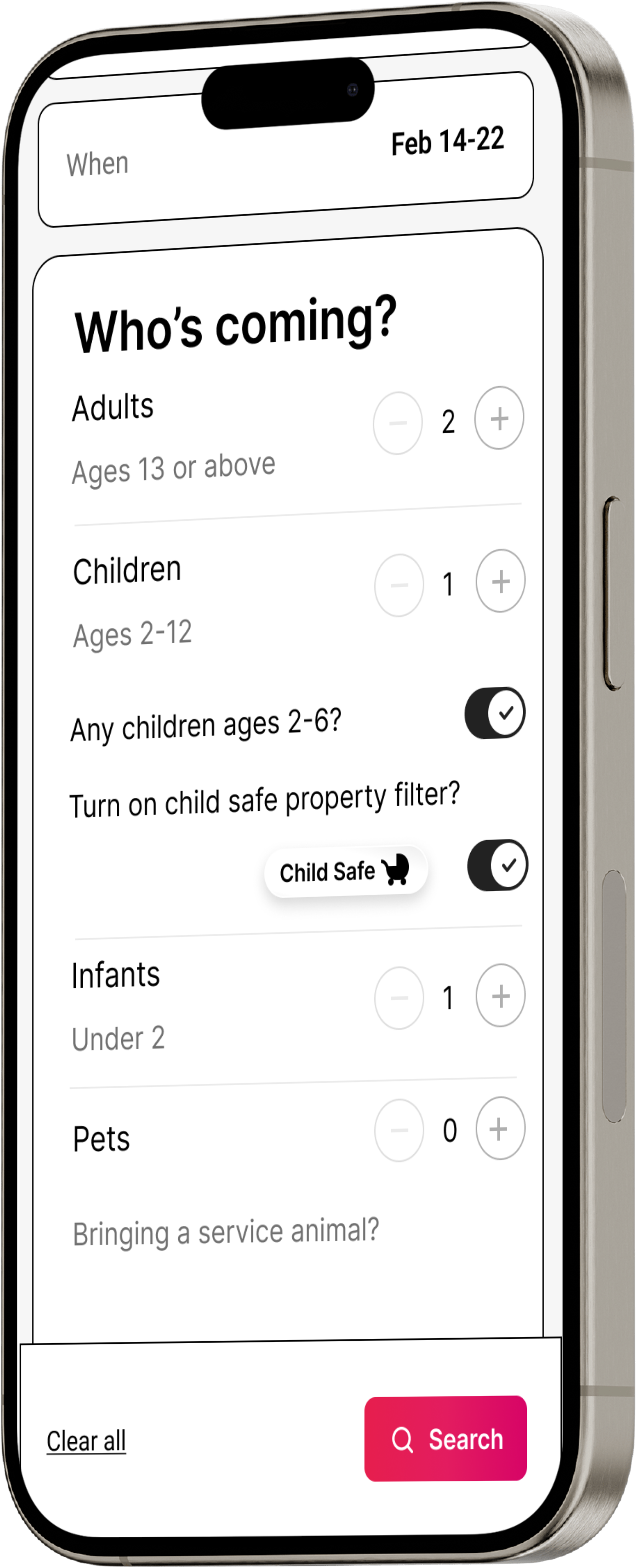
Here is where the added feature first appears as in Flow #1. A toggle asking the user if any of the children they are traveling with are under the age of 6. Next the user is asked if they would like to turn on the child safe filter. It made sense to only ask user about child safety feature only if they are traveling with children below the age of 6.
Search results and filter screen
The search results, complete with the child-safe properties clearly listed. Icons appear prominently, signifying that they have been confirmed to be child safe and verified. They appear where Airbnb already places their guest favorites icon.
On the filter screen, one can easily itemize and specify what particular safety options they are searching for or toggle all available safety features ON with a single click. This convenient interface allows a user to filter their search results based solely on the specific features that they are looking for, allowing for a more tailored filter


Does it work?
Usability Testing
After the initial prototype was completed, it was tested via Zoom with the 5 participants that are parents, including 1 father and 4 mothers.
Ages range from 34 to 44.
Task #1: Booking with Child Safety in Mind
Users were instructed to book a vacation property with child safety in mind.
Task #2: Using the Safety Filter
Book a vacation property with child safety in mind using the filter icon button in the top right corner.
Task #1
Feature accessed after entering destination and dates of travel.

Task #2
Feature accessed by finding the filter icon on the home screen.

Results
Users enjoyed the simplicity of using the added feature.
Overall, users loved the new the filter options. Some participants experienced challenges wondering whether to click the toggle or checklist in the child safety filter options, but liked having the options.
6 out of 6 Easily completed Task #1 and #2 with a high rating.
4 out of 6 Recommended combining the child safety filter with property type or amenities for better accessibility.
1 participant actually intuitively went to Task #2 first by selecting the filter option before putting in a destination
3 out of 6 Encountered difficulty with the filter placement in Task #2, suggesting it should be higher in the interface.
Recomendations
Child Safety Filter Placement:
Consider moving the child safety filter higher in the interface, alongside property type or amenities.
Make the child safety filter more prominent, without cluttering filter page.
Improved Accessibility:
Enhance the overall accessibility of child safety features, possibly by reducing text and providing clearer explanations.
Clarify the functionality of the toggle versus checklist in the filter options.
Explore alternative designs for the child safety icon to ensure clarity for users.
Verification Badge:
Explore the idea of introducing verification badges for child safety features to increase user trust.

Priority matrix
Iterations
Post usability test
After valuable feedback was gathered from the usability tests, key iterations were preformed on the prototype.

Add a feature appearance
On these screens I’ve cleaned up any spacing issues, got rid of the child safe icon, and lined
up the toggles based on the usability test hopefully eliminating any instances of confusion as seen by 3 out of 6 of the participants.

Filter screen
On the filter modal screen I added a Child Filter tile similar to the current Guest Favorite one already used by Airbnb. I placed it higher up on the filter screen as desired by all 6 out of 6 participants in the usability test. This allows for less scrolling and quicker access to the child safe feature.
Before
Type of place image was removed, therefore shortening filter and reducing scroll length.

Before
New filter toggle

The icon is removed , giving the iteration a cleaner look.
The new icon badge

Old confusing icon
New appearance of child safe filter, higher and more prominent on the filter screen for improved accessibility.
Final prototype
Home screen
On this home-screen I put the child safe toggle on feature front and center as requested by 3 out of 5 participants in the usability test.
Before

After


After
Search results
The first rendition of the verified child safe icons were confusing and misleading. 4 out of 6 participants did not find the life preserver intuitive as being a child safe icon. The baby carriage was introduced and made prominent on the image of the listings for heightened visibility. The new variation is more in line with the system Airbnb already has in place, in accordance with their guest favorites.
After

Before
After
Next Steps
Moving forward, the project will involve more usability tests with a refined prototype to further hone the safety feature. Follow-up interviews will be conducted to gather deeper qualitative insights on user expectations and preferences, and to evaluate the perceived value of verification badges. Additionally, the refined safety features will be implemented in a controlled A/B testing environment to assess their impact on user satisfaction and booking conversions.
Lessons Learned
Throughout this project, several key lessons were learned. One of the main challenges was aligning the diverse needs and preferences of parents and caregivers, which highlighted the complexity of designing a comprehensive yet user-friendly safety filter. Unexpected findings, such as the importance of child-friendly amenities and entertainment options, underscored the need to consider broader aspects of family travel. Regular reference to user personas and iterative usability testing were critical in ensuring design solutions met user needs. Trade-offs, such as balancing detail and simplicity in the safety filter, required careful decision-making. Key takeaways include the importance of flexibility, iterative testing, aligning design with business goals, and effective time management and prioritization.